Mine is mapping. I am a big OpenStreetMap contributor and I have mapped many towns near me that were previously completely unmapped.
Mine is mapping. I am a big OpenStreetMap contributor and I have mapped many towns near me that were previously completely unmapped.
I have a weird obsession with fonts. I love a good, well designed font. How it looks on the screen, how it looks in print. Nothing too gaudy or showy, but a really good League Spartan or Lato Light. (Not a fan of serifs)
Other than that, normal stuff; 3D modelling, writing, etc…
My other interest that might fall “outside the norm” is that in University, if I had continued beyond my bachelors my primary focus would have been studying the Bronze Age Collapse, and that topic still fascinates me to this day.
Edit: Oh…and spreadsheets. There’s no problem in the world that can’t be fixed with a well designed spreadsheet. All problems come down to data sorting.
Oh my God I LOVE FONTS
Spartan is a bit wide for me (see that w?) but Lato with a good colorscheme is always sexy
Another thing: if you’re familiar with fonts you can have a weird pseudo-Sherlock funtime guessing how something was made.
and
About serif disdain… what about LaTeX’s serif? :}
Brick?
Anyway, maybe you have some insight - any idea why so many web designers prefer Light or Hairline now? Or at any rate the thinnest possible fonts? Did someone with credibility announce that thin fonts are actually easier to read, or is it just a style trend?
Not that in particular, but design often comes down to the function f(keywords the branding people like) = very same-looking things. Yay trends.
A lot of fashion companies wanted to be “simple. bold. modern but ready for the future.” Now all their logo fonts are basically the same. It’s also why everyone loves Futura.
With websites, brand people pick the keywords “calm, professional, modern, reliable” and end up with blue so much that it’s the most common website color. So I’m not surprised that the web designers in question picked something “friendly” and “modern” like some font you’d imagine would go well as white text on a matte or charcoal background.
Same reason why I see so much Comfortaa on slideshows (alphabetically near the start of the font list, and f(modern, smart) = title font)
If you’re into Computer Modern, almost all modern tech variants (not Knuths original) are too light in print. If you look at his printed books from back in the day the letters are thicker. It’s just a consequence of using one technology instead of the printing tech the font was designed for. Same thing (but more extreme) happened to Centaur btw.
Check out the pictures of CM here: https://www.levien.com/type/cmr/gain.html
Ayy fellow font enjoyer! I have like 50 GB of fonts, I’m a bit crazy. Honestly, Noto Sans is the greatest font out there. Looks good everywhere
I like Noto Sans. But as a Linux user it often irks me too, since every…single…language…is included in most distributions; so half of my time finding a nice font that I just installed consists of scrolling past a bajillion Noto variants.
Haha, yep. You can uninstall the other languages if you want though.
I know, I’m just really lazy!
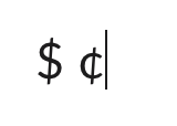
I have almost no opinions on specific fonts. Except… I absolutely despise the $ and ¢ symbols in Apple’s San Francisco font. Since it’s the default font I have to look at it a lot.
Are the vertical lines angled? Or is that just an optical illusion?
they are
They are very much angled and it drives me insane.